Problem
Contacting customers to sell products is not only expensive but also quite uncomfortable for people who are constantly being pitched offers they’re not interested in. That's why it is increasingly important to get insights to try to predict how customers might react to a promotional offer.
General Goal
To reduce the costs of reaching out to customers and to improve the efficiency of brand activation campaigns.
Result
By developing a Classification model, which is a supervised machine learning technique that can be used to predict categories by understanding the relationship between the dependent variable and the independent variables, we are able to decide which customers are more likely to respond positively to a promotional offer.
Why is it useful in marketing?
1) By predicting the customers who are most likely to respond positively to a sales activation, we are able to create better campaigns with higher ROI.
2) The evidence is that widespread promotions can be damaging in the long run, tarnishing a brand’s image, increasing price sensitivity and reducing brand loyalty. By creating targeted sales activations, we are able to mitigate those risks.
3) Intrusive media is a source of anger. The harder a channel is to ignore, the more virulent the reaction. By targeting the people who are most likely to subscribe to an offer, we are able to be less intrusive, therefore preventing long-term brand damage.
Short Report
Context
This project was based on a dataset provided by NOVA IMS.
It follows the CRISP-DM Methodology.
Key Technologies:
- SAS Enterprise Miner
- Microsoft Excel
1. Business Understanding
Deciding whether or not to diversify poses a big question for businesses. A company offering a broader range of products might run the risk of spreading their resources too thinly or too broadly. Predictive models could help us classify who, from a large dataset, are more likely to buy a new product based on data from a smaller database, namely from a pilot test, therefore decreasing this risk.
In the context of this project, the client is a winery who want to launch a brand-new product - a wine dehumidifier. Our objective is to predict customers who more are likely to buy it based on their features and buying patterns from historical data.
We’ll use a classification model, which tries to draw conclusions from the input values given for “training” – sample data from the pilot campaign. From this small sample of data, it will predict binary class labels, in this case ‘buy’ or ‘not buy’, for new data - the company’s whole range of clients.
We aim at maximizing the return of investment, by knowing before hand that a contact would cost 2€ and a positive response would worth 8€. Once the model is defined, we can import a dataset with the clients we intent to contact and it will predict which ones are more likely to accept our offer.
2. Data Understanding
At this stage, we aim at grasping a better knowledge about the different data touch points and dive into the business meaning of the data being leveraged.
The dataset includes 28 variables and 10.000 random customers who have purchased something from the company in the past 12 month.
Some of the most relevant variables in this customer signature table include:
- FREQ - number of purchases in past 12m
- INCOME - household net income
- DAYSWUS - number of days as a customer
- EDUCATION - highest academic degree earned
- RECENCY - number of days since last purchase
- LTV - customer lifetime value (derived variable)
- MONETARY - total sales to this person in 12m
- WEBPURCH % - of purchases made on website/app
To get a better sense of the data we should do a preliminary statistical analysis.
Some aspects we can conclude by just looking at the statistics for numerical variables are:
- Variable DAYSWUS – most customers are with the company for way over a year (the minimum values are 550 days)
- Variable FREQ – the average customer made around 14 purchases in the last 12 months. Although we need to investigate those negative values, since there shouldn’t be a negative number of purchases.
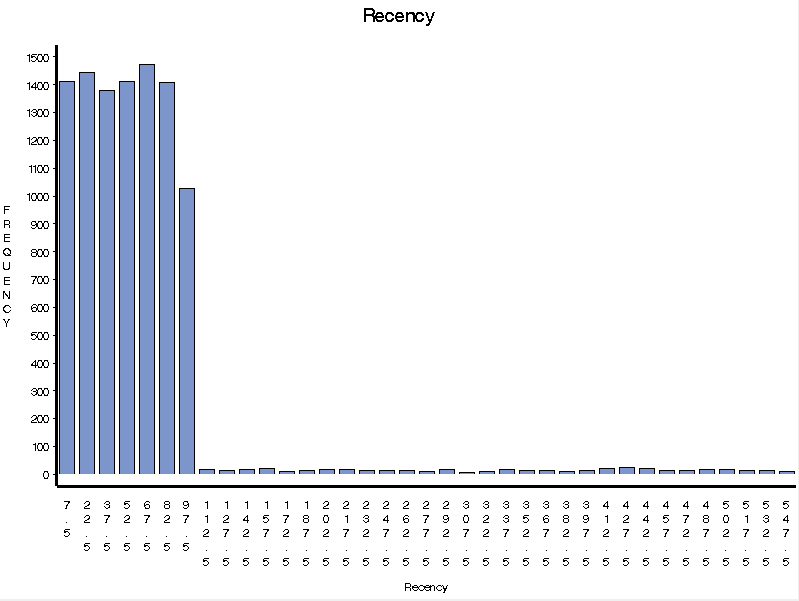
- Variable MONETARY – the average total amount of sales to a person in the last 12 months is 926€. We can also see that this variable is also highly positively skewed, which indicates that there should be a lot of customers buying small amounts while a small number of customers buy huge amounts. That is confirmed by a mean of 383€ and the standard deviation. We can see that RECENCY follows the same trend.
Other important observations for our analysis are to see that the variable NPS has over 7781 missing values, which are much more than the inputted values, 2219. This means that we probably won’t be using it for our analysis.
By looking at the plots, we get a better sense of the data. It's clear that, although there are extreme values for Monetary, most of the clients don't spend that much at the company . The same goes for Recency (two images on the left).
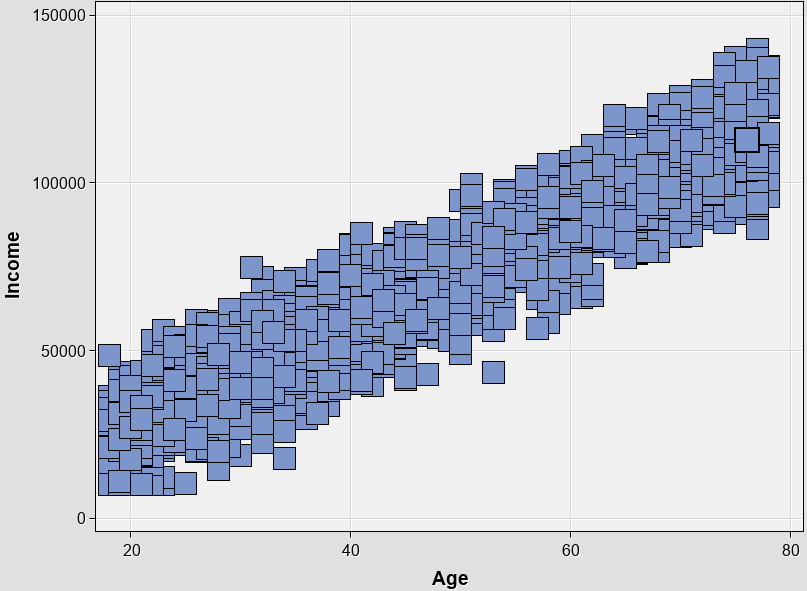
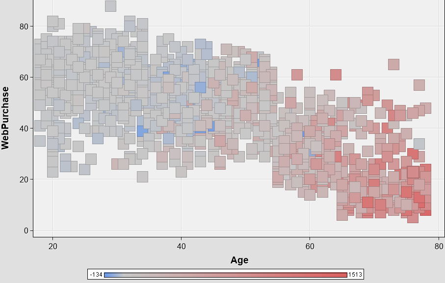
When we relate variables using scatter plots (two images on the right), we can see that Income tends to increase with Age, and that most Webpurchases are made by younger folks (last image on the right).

We can also analyze categorical variables. These are qualitative variables that can take one of a number of limited values, but there is no intrinsic ordering to the categories.
We can see that we have 8 different categories in education, some of those erroneous, and that most of our clients have a higher level of education – masters and bachelor’s degrees.
We also have more data missing data than filled in Expressed Preference variable, thus it is likely to be dropped from further analysis.
We can also take a look how the different variable related to our target variable – ‘humid’, which provides the label ‘buy’ / ‘not buy’ from the training dataset. The color red identifies the frequency of purchases among the different groups of people.
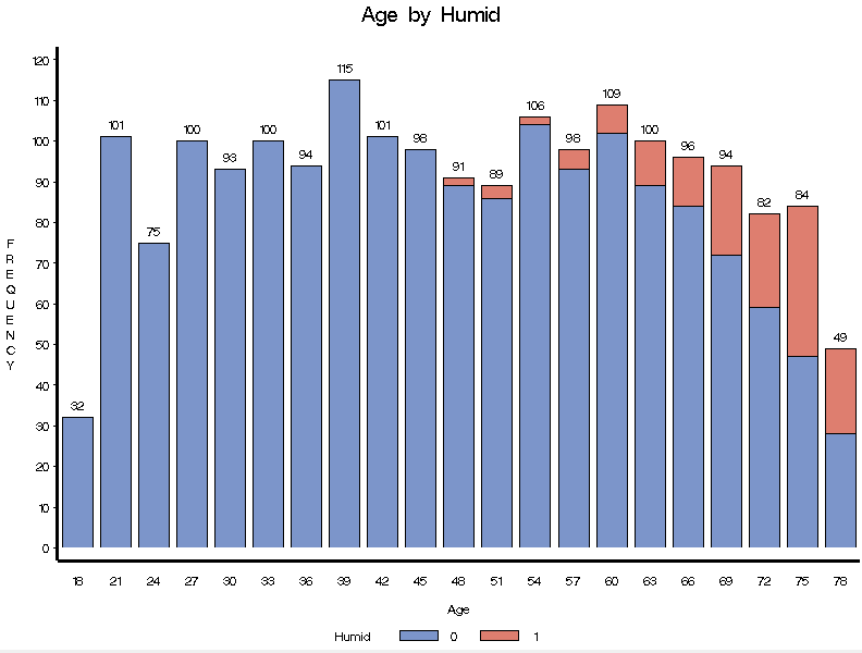
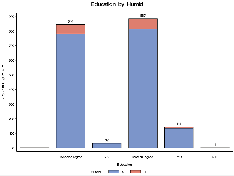
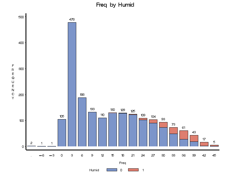
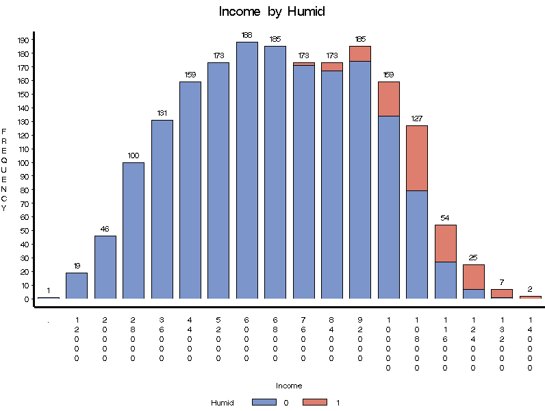
In a first look, we find out that the people most likely to buy the dehumidifier tend to be older, to have higher income and education, as well being more frequent buyers of the company.
Pearson Correlation
Regarding correlation, we can see, for instance that Frequency and Lifetime Value are highly correlated, which makes sense – a person who buys more frequently has higher lifetime value for the company. We see that Age is also highly correlated with income, meaning that older people tend to have a higher income.
3. Data Preparation
After the analysis of the dataset, is time to get the data ready for modelling. At this stage, we perform things such as:
1) missing values (aka data that is missing from our dataset) and define a strategy for dealing with it, which simplistically can be either remove or to impute values;
2) extreme values, the so-called outliers, and the skewness of the distributions, depending on the model we intent to use;
3) fix typos, like the one in the ‘Education’ variable, therefore correcting the number of different classes;
4) feature engineering – it involves leveraging data mining techniques to extract features from raw data along with the use of domain knowledge. It is also useful to improve the performance of machine learning algorithms.
In this case, we created new variables such as ‘Average Spend per Purchase’, which divides a client’s monetary value by its purchases, among others.
4. Modelling
Generate test design
The first step to take as this stage is to divide that data into two datasets:
Train Dataset: Used to fit the machine learning model.
Test Dataset (in this case it will act as the validation dataset): Used to evaluate the fit machine learning model.
Test Dataset (in this case it will act as the validation dataset): Used to evaluate the fit machine learning model.
Samples from the original training dataset are split into the two subsets using random selection. This is to ensure that the train and test datasets are representative of the original dataset.
In our case, the data was split into:
Train: 70%, Test: 30%
In this case, as this is a classification challenge, I understood feature selection as a hyper parameter optimization. Therefore, I performed it at this stage.
Feature selection includes the process of removing variables that fail to meet the assumptions of your model, such as non-normality, imbalanced classes, multi-collinearity.
In SAS Enterprise Miner have access to the “Variables Worth”, in the Stats Explorer node. This shows the relative importance of a variable to the target variable.
Usually around 10 variables are enough for this kind of project. The selection criteria were:
1. variables with the biggest worth –until a point where the worth starts decreasing significantly
2. variables cannot be highly correlated with each other (based on correlation coefficients over 0.8 or below -0.8)
2. variables cannot be highly correlated with each other (based on correlation coefficients over 0.8 or below -0.8)
Based on this, 7 variables were selected to make the prediction:
Web Purchases
Average Spending
Absolute Value of “Sweet White Wine” Purchases
Absolute Value of “Sweet Red Wines” Purchases
Absolute Value of “Exotic Wine” Purchases
Absolute Value of “Dry White Wine” Purchases
Absolute Value of “Dessert Wines” Purchases
Average Spending
Absolute Value of “Sweet White Wine” Purchases
Absolute Value of “Sweet Red Wines” Purchases
Absolute Value of “Exotic Wine” Purchases
Absolute Value of “Dry White Wine” Purchases
Absolute Value of “Dessert Wines” Purchases
I tested 3 different classification algorithms with distinct parameters:
- Logistic regression, with 3 different parameterizations;
- Decision Trees, with 6 different parameterizations;
- Neural Networks, with 18 different parameterizations;
5. Evaluation
In order to measure the performance of the model, I looked at indicators such as AUC - ROC curve, cumulative lift, lift, % response and ROI.
Based on this, the Neural Network with 3 hidden units, model selection criterion “Average Error” e “Weight Decay” = 1 was the one with the best performance.
Area Under de Curve (AUC)
Our aim is to maximize the Area Under de Curve (AUC). This curve tells us how much the model is capable of distinguishing between classes (in this case, between “buy” and not “buy”). The higher the AUC, the better the model is at predicting "buy" classes as "buy" and "not buy" classes as "not buy". Our model scored a AUC of 0.942, which means that there is a 94.2% chance that the model will be able to distinguish between “buy” and not “buy” in the test dataset. This is explained because of the relative simplicity of the dataset.
Lift
Lift is a measure of the effectiveness of a predictive model calculated as the ratio between the results obtained with and without the predictive model. The lift chart shows how much more likely we are to receive positive responses than if we contact a random sample of customers. In the case of our project, by dividing the number of positive responses (people who bought the item) in the test dataset by the number of positive responses, by the total number of contacts, we get a response rate of 7,67%.
By using the model, we can see that just by reaching out to 10% of selected customers we have a lift of around 7, which means that we could have a response rate 7 times higher.
ROI
To calculate the Return on Investment, we move to Excel. There the predictions are sorted by the likelihood of positive response and compared to the actual response. We can see that, for instance, the customer 1269 bought the product (Humid = 1), and our model also predicted so with a likelihood of 0.97. But, for instance we predicted that customer 2790 would buy the product, but he actually didn’t (Humid = 0).
With this information, we can easily calculate the response rate and therefore find out at which point we would reach the highest ROI. In this case, the maximum ROI with be reached by contacting 10%.
Finally, it is only required to import the dataset with the clients we intend to reach, all of them, and the model will figure out which ones are more likely to provide a positive response to the marketing campaign.
